 wolfe with an e's blog
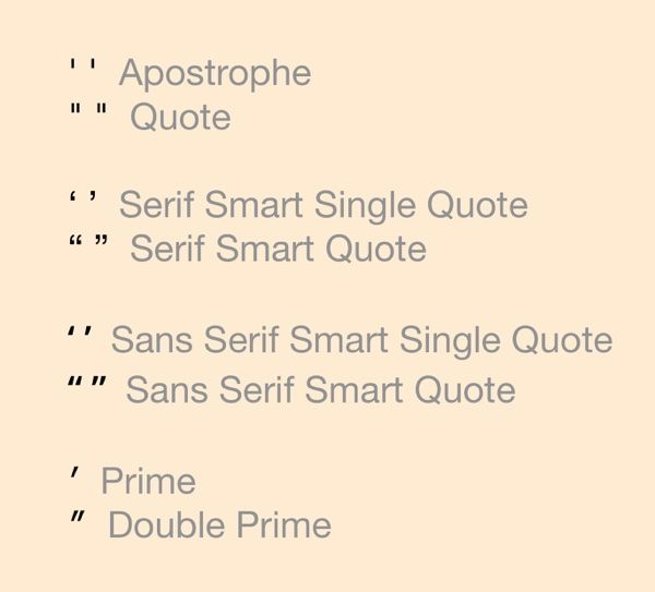
The great "smart quote", er “smart quote” conspiracy.
For years, typographical snobs have pushed us to adopt smart or curly quotes and smart or curly apostrophes. Often the reasoning is that “real” quotes are not those foot and inch marks you see on your keyboard. But here’s the problem: The foot and inch marks on the keyboard—are totally a myth.
The apostrophe has been there since the very first keypress.
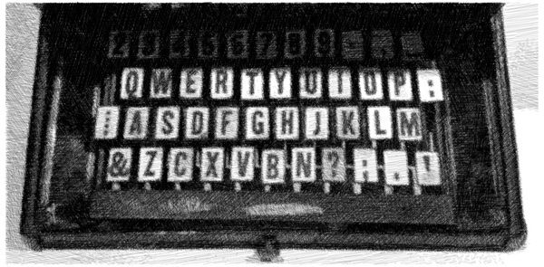
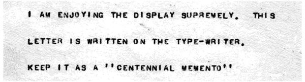
The first QWERTY keyboard (pictured in the sketch above) was invented by Christopher Latham Sholes in 1873. Though it only typed in caps and didn’t have a one or zero key, it very much did have a straight apostrophe. (It’s at the bottom right.) If you needed a quote mark, you just typed two apostrophes, as seen in the letter below typed at the 1876 Centennial International Exhibition in Philadelphia. Later, once the shift key was added to the typerwriter, an official quote character appeared.
Technology never changed the appostrophe or quote mark. When the ASCII character set came along in 1960 and Unicode appeared in 1987 the straight apostrophe was still called an apostrophe (or single quote) and the straight quote (or double quote) was called a quote. They’ve never been called feet or inches. Curiously, you so seldom see quotes and apostrophes represented in the curly form on keyboard keys.
Foot and inch marks really are a thing.
ASCII didn’t have the enough characters to accommodate smart quotes. But when Unicode came along, they were added. Unicode also added the official characters for inch and foot. They’re called prime and double prime. So anyone snooty enough to go on about the sin of not using smart quotes and smart apostrophes, should also be using the real characters for inches and feet, not straight quotes and apostrophes. (Good luck finding those on your keyboard.)
Steve Jobs little joke.
On his early computers, Saint Steve, like Bill Gates, was forced to default to that “dumb ASCII”. This character set had evolved out of the telegram system and became well established in live data transmission for teletype machines. Since it was the only character set that was cross platform, ASCII text is how the web pages first appeared and usage wasn’t surpassed by Unicode all the way up until 2008.
Even before Unicode took over, Jobs pushed fonts that had smart quotes for a very good reason: he wanted Apple computers to rule digital publishing. And publishers, at the time, were the only people using smart quotes in lead type, letraset press-on letters or whatever. Up to this point, typing and publishing were separate disciplines: Hemmingway and Vonnegut used straight quotes when they typed their manuscripts and a typesetter added the curly quotes when printing. It’s only when Jobs made it possible for one person to both write and publish that anyone had any concern about smart quotes.
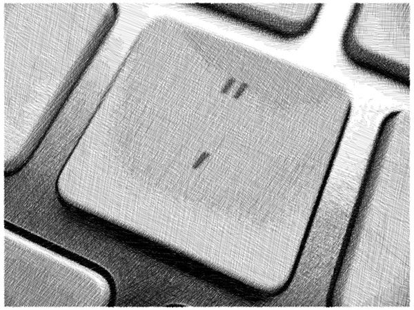
Now here’s where it gets ironic: Despite the push for curly quotes, it seems Apple never used curly quotes or curly apostrophes to represent those characters on their keyboard. As you can see from my current Mac keyboard above, Apple uses what looks—for all the world—like real foot and inch marks. It seems that all those modern-looking, san-serif fonts included smart quotes, but didn’t actually make them curl. Instead they’re just slanted or upside down, so they often don’t look like smart quotes at all. So the curly-quote crowd should to stop calling smart quotes “curly”, because usually they’re not.
So was it a massive oversite that Jobs didn’t put distinctive curly quotes on the Apple keyboard? Probably not. More likely he thought that people always called them foot and inch marks, so he figured: lets make this as easy as possible to find them on the keyboard. But in reality, it just confuses things even more.
The world is not quite ready for smart quotes anyway.
Despite the smart-quote push, the practice of using straight quotes and straight apostrophes are still more universally logical. The smart quote adoption on the web is about 20 years old now, but still has its struggles. A few problems:
- Some browsers and systems still rely on ASCII. SMS messages often are. Also, sometimes smart punctuation doesn’t survive copy and paste on some devices and gets dumbed down to “dumb” quotes.
- Not all the fancy new fonts include smart quotes and apostrophes. Seems many of the new font creators still follow ASCII standards. I had to render the chart at the start of this article as an image, because—you guessed it—this font you’re reading in now, that was rated most readable, couldn’t render all those characters properly.
- On lower-resolution screens, it can be hard to tell the orientation of smart quotes and apostrophes apart, resulting in them being typed facing the wrong direction or being upside down. With straight quotes and apostrophes, you never have that problem.
- Most OSs now allow you to turn on smart punctuation to convert straight quotes and apostrophes to smart, but is not 100% accurate. A common flub is that smart punctuation gives you a left single quote instead of an appostrophe when used at the start of something, as in ‘90s.
Sadly—whatever device you’re reading this on now—could be showing smart quotes as this: �, the Unicode Replacement Character when characters are missing from a font set. I run across this regularly on the web and in email, when ASCII got involved somewhere along the way.
HTML don’t know no smart quotes.
The problem for me personally, and most web writers, is that the web runs on Markdown, an HTML shorthand that requires you to type straight quotes and apostrophes in tags. Markdown and HTML handle smart quotes fine when they’re in the text, but when the device you’re typing on tries to replace the straight quotes in HTML or Markdown tags with smart quotes, all hell breaks down. As a result, I’ve had to turn off Smart Punctuation on my iPad. I could maually type Option+[, Option+Shift+[, Option+]* and *Option+Shift+] for smart quotes and apostrophes, but that’s not intuitive at all and another level of annoyance altogether.
And one final thing: the smart apostrophe you get may not be an appostrophe at all. It may just be the right half of the single quote.
So who dunnit?
All conspriacies, even the foot-and-inch-mark debacle, have a diabolical perpetrator and it looks like—as in many cases—society is to blame. What we now call prime and double prime symbols have been hand scrawled by architects, builders, mapmakers, astronomers, mathemeticians and other scientists for years to represent everything from feet and inches to minutes and seconds of an arc. It’s likely that as we switched over to the limited character set of typewriters, the prime marks were substituted with dumb apostrophes and dumb quotes when typing, since those were the closest thing on the keyboard. So it’s the public that seems to have made the misnomer. Unfortunately the pro-curly-quote crowd has erroneously been using this as their battle cry, which kind of makes them look, well not so smart.
It seems to me that we’ve gone to great lengths to formalize our writing with smart quotes, at a time when writing is more and more public and less and less formal. Personally, I’m fine with the historic straight quote and apostrophe, since that’s what those keys on your keyboard have been intended to type for 150 years now. My blogging platform Blot.im automatically coverts straight quotes in text to smart quotes for me. So if the system changes them correctly, I’ll let it. Though, always checking to make sure any system got it right is one more little annoyance that makes us spend more time on formality that would better be spent on creativity.